Smallbany Gallery's Mission Statement:
Smallbany Gallery presents an opportunity for artists to work creatively and in thought-provoking ways without spending large amounts of money, time, and space on a life-scale installation. We're committed to doing as much as we can to benefit artists who show, while simultaneously working to remove barriers to showing engaging work. There is no submission fee, and no requirement for education. The gallery is a non-commission space and all sales are organized by (and benefit 100%) the artist. We are working towards being able to cover shipping costs and hope to soon offer a small stipend to artists. Smallbany Gallery is committed to showing and supporting historically underrepresented artists - including BIPOC, LGBTQ, and womxn artists.
0 Comments
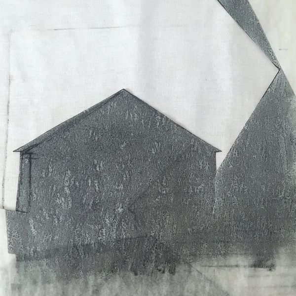
"Smallbany" - A look into my first woodcut, Big Ink, and differences in types of printmaking12/30/2019 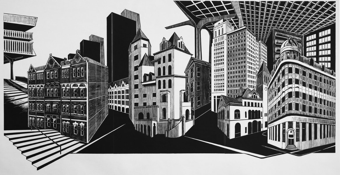 I recently completed this massive woodcut print, my first ever woodcut, over the last four months, culminating in a printing session with a mobile program called Big Ink. In this post I’ll share a look at the process behind the print, and how it differs from the work I’ve done in recent years. 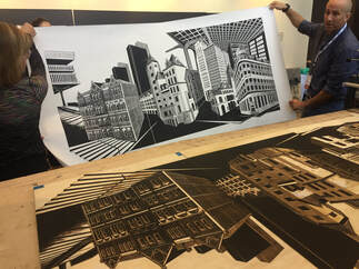 Big Ink allows participants to print as “small” as 24” x 36”, and up to 40” x 96” - I knew I wanted to do a really large woodcut, but wasn’t sure exactly what place to use for the image. Due to the scale, focusing on just a single home (like in my recent work) seemed unsuitable. I considered several homes or a neighborhood. The scale of the block seemed to call for appropriately monumental buildings, so I settled on a composite of Albany’s notable downtown architecture. 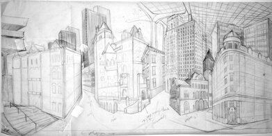 I started a series of in-person sketches and photographic “visual note-taking” on several walks through downtown Albany. Compiling sketches into a composition took a few weeks of tweaking, rearranging, and adding and subtracting detail. 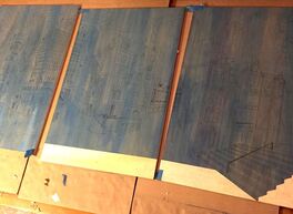 I took the design and mirrored, enlarged, and printed it using this site. A layer of sharpie helped me build up lines, add more detail, and think through a bit of how the carving would work. I transferred the design to the sanded, prepped cherry plywood using carbon paper. The plate looks blue because I applied a thin acrylic wash to help me better see where areas had been carved. 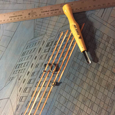 One major draw of Big Ink participation was that I had access to a number of clear, helpful tutorial videos, including information on carving tools and how to use them. This set of Mikisyo wood carving tools was recommended as a good starter variety, and I also ordered this small v-gouge that I found absolutely necessary in many details. A strop for honing tools is a must as they need to be cared for frequently to cut well. There are some electric and power tools used by woodcut printmakers, though I only used a router in the large negative spaces. Some people have good results with Dremel attachments, and I met one artist who used a circular saw to get some really expressive marks. I highly recommend practicing on a piece of scrap wood before beginning a real plate – and I also would recommend starting much smaller than 36”x72”… 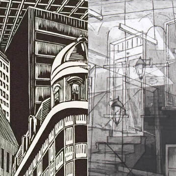 A detail of the black and white woodblock compared to a recent etching with aquatinted grays. A detail of the black and white woodblock compared to a recent etching with aquatinted grays. The biggest challenge for me was adapting to the differences between the new-to-me woodcut relief techniques and the intaglio etching techniques I had been using for years. This woodcut would mean using only black ink and white paper to creates a range of lights and darks, so I needed to adopt techniques like cross-hatching. Woodcut is a type of relief printmaking, which means areas that are carved sit lower and do not receive ink – essentially meaning the anything I carved would be white and anything left would be black. Intaglio etching is additive; a line is etched, and ink is worked into it while un-etched areas remain white. Etching allows for a technique called aquatint to get washy shades of gray by etching an open area with a texture to grab ink. I found that I really missed aquatint’s grays when I started carving, but woodcut grew on me throughout the process. 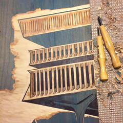 One regret was that I didn’t keep track of the time I spent on the project; a low estimate is over a hundred hours from design to print. To give a sense of the time consuming carving process, this part of the New York State Museum took 4 hours. A snow day in November granted me a 14-hour carving day. Carving itself I found satisfying and meditative, but the scale of the project and looming deadline meant several weeks of teaching a full day, and coming home to carve until bed. 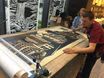 Printing at Big Ink’s event day was equal parts exciting and anxious. As a first at woodcut printing, I was worried about how dark some parts of my design would be. Lyell Castonguay and Carand Burnet were great to work with; they run Big Ink and help the artists ink and print using their massive, custom-built portable press, nicknamed “The Big Tuna.” I was familiar with how relief printing works, but it was a great learning process to see how professionals are able to work so efficiently at a large scale – everything from how to load paper, set plates and registration, and apply ink evenly. Because my design was split across three panels, there were a lot of places things could go wrong in printing and registration; pulling the first print and seeing it work out was a huge sense of relief (pun only sort of intended). 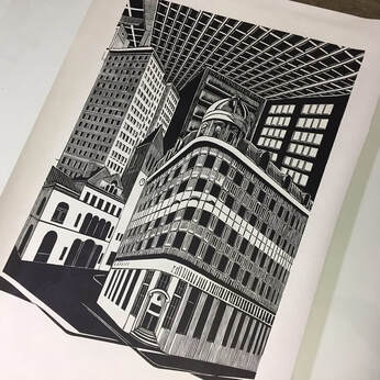 Printmakers have the ability to produce multiples to the extent that the plate materials allow, but many will cap the number they make to create a limited edition – there are only three prints of the full three-panel image in existence. One will always be mine, but two are for sale here. I am producing a limited edition of 25 of each individual 36" x 24" panel, and those can be found here. For those who might be wondering how to frame such a large print, I’ve found that they look great unframed, and I display them at home using small disc magnets to hang them without puncturing the paper.  When I finished the project, I said it’d be a while before I did another woodcut – it took me less than a week to start one. I’m working on a small piece from a series of sketches and photos taken on hikes in the High Peaks, just for me, without any deadlines. I still miss the grays allowed in etching, but there is something to be said for the convenience of carving by hand and not needing the acidic solutions used in etching. It’s only a matter of time before I do another etching, but for now I’m looking into combining woodblock printing with the sculptural techniques I've used in other recent pieces. If you’d like to see any of my prints or sculptures in person, I have a show coming up at the Lake George Courthouse Gallery in March 2020, and pieces in a variety of sizes and prices are available in my Etsy shop here.
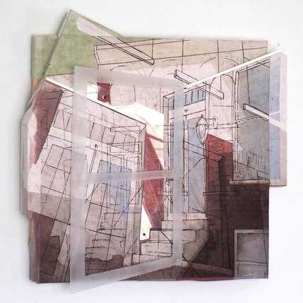
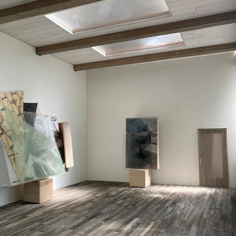
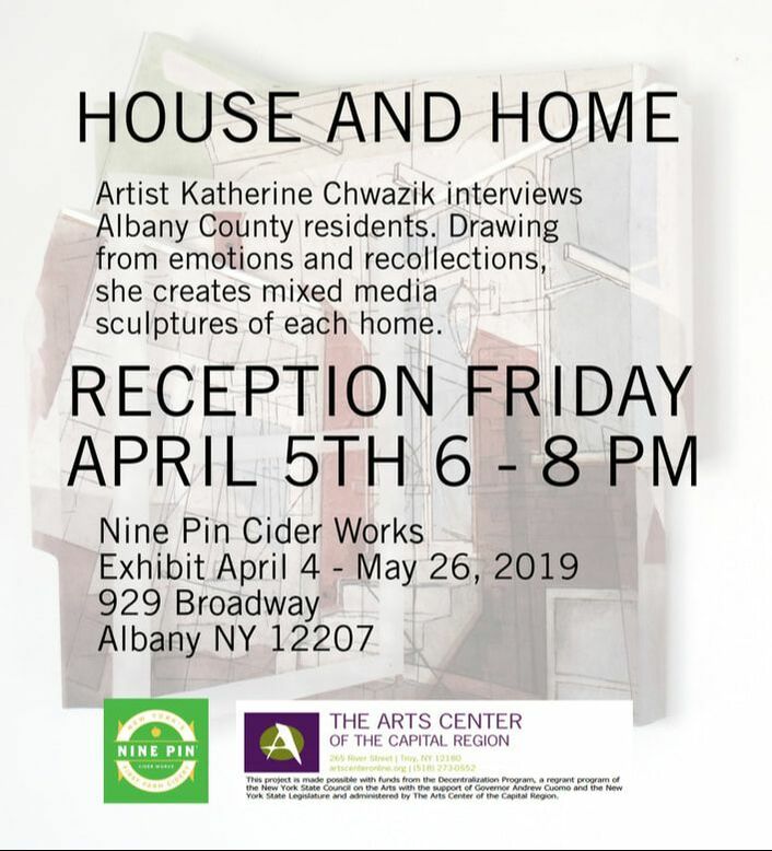
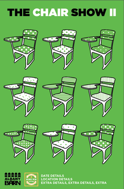
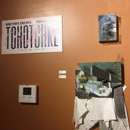
Exciting news all! I'm happy to announce my upcoming show, "House and Home", will be opening next month at Nine Pin Ciderworks in Albany. Information about this show as well as "The Chair Show II", opening the same night, is below. Hope to see you there! 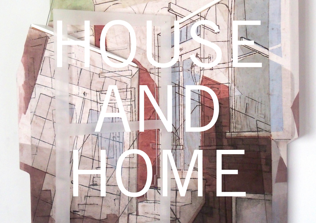 Two art shows open Friday April 5th, 2019 for a reception from 6 to 8 PM at Nine Pin Cider Works in Albany, NY. House and Home features new work by Katherine Chwazik, and is on view in the Tasting Room through May 26th, 2019. The Chair Show II, a collaborative exhibition between Albany Barn & local artist Tim Fealey, features 17 area artists, and is on view through April 7th, 2019. Both shows explore connections between local artists, local history, and a broader community.
Many thanks to Nine Pin Ciderworks, the Arts Center of the Capital Region, and the Decentralization Regrant Program of the NYS Council on the Arts, without which this project and show would not be possible.
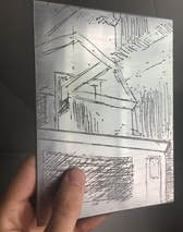
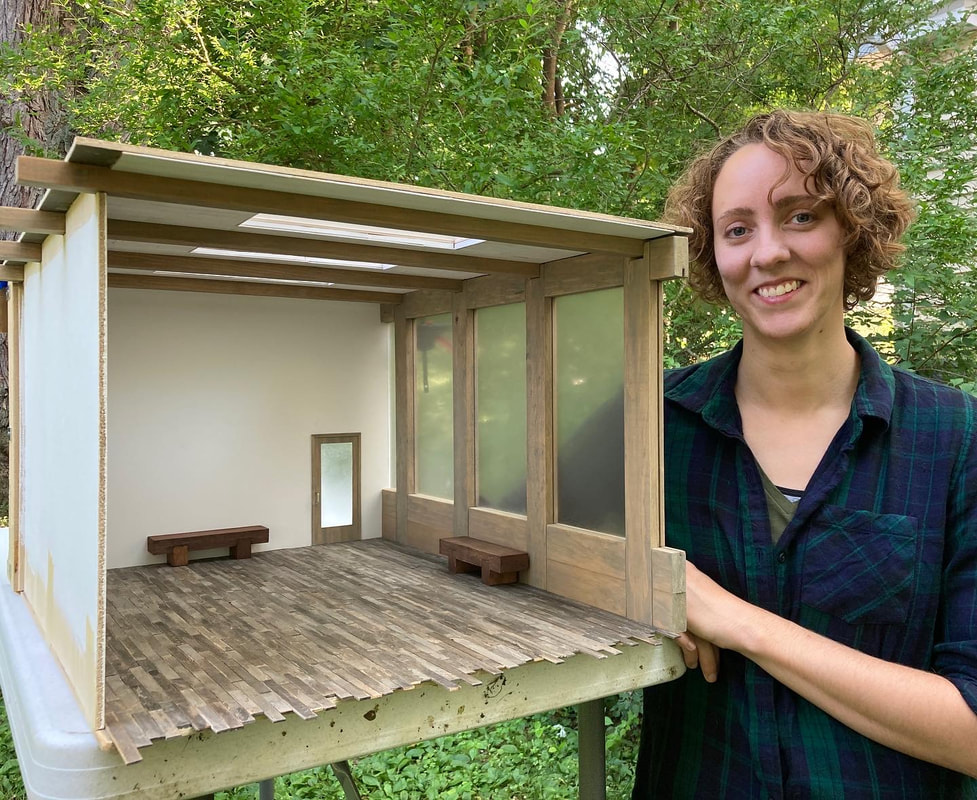
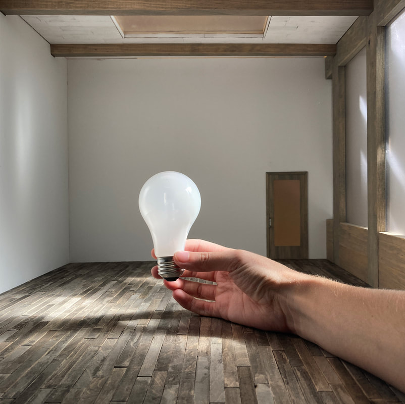
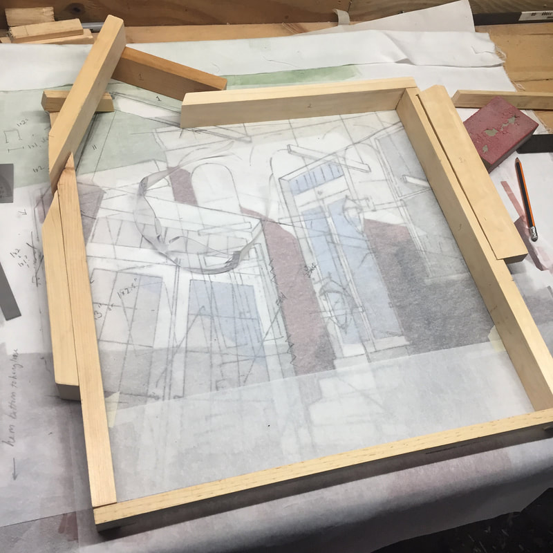
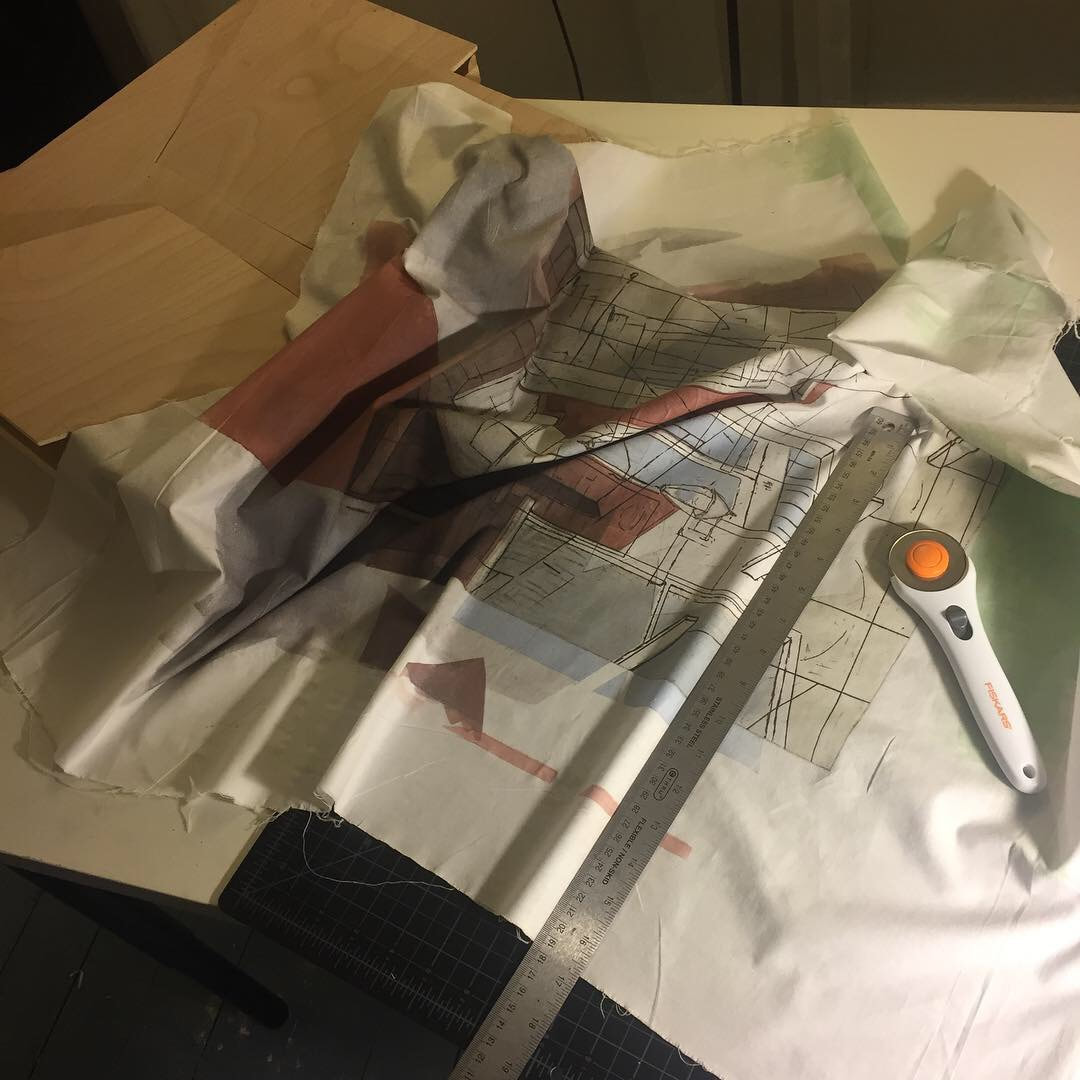
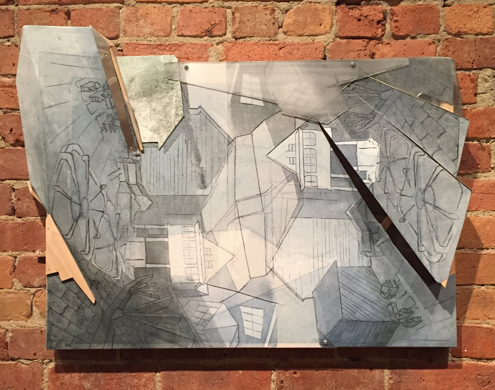
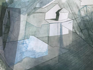
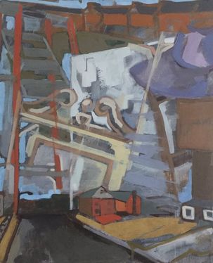
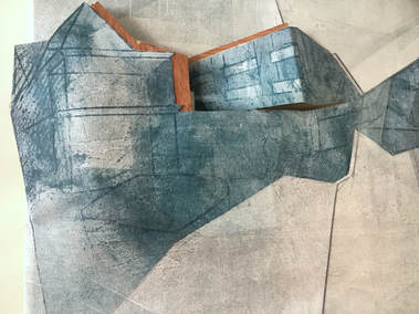
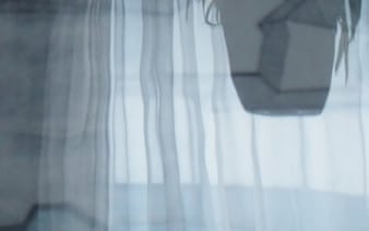
 I'm excited to share my most recently finished piece - "Window of Opportunity", Irving Street - and to share a glimpse into the process for one of my mixed media sculptures! The wonderful Cindy Henry is responsible in many ways for this piece. In a grander sense, I am who I am thanks to her encouragement many years ago to consider teaching art, and on a more recent level, her interview is the origin of the Irving Street piece. When I first began to consider bringing others' experiences into my work, Ms. Henry mentioned that she had lived in downtown Albany. The interview is an interesting conversation about her experience living on Irving Street for a summer in the home of one of her own former art teachers. We chat about the visual characteristics of the home as well as its emotional and nostalgic qualities. The timing of her experience there added a lot of meaning; she describes the summer after finishing college as a freer time when the world was opening up and anything was possible - "a window into the future." 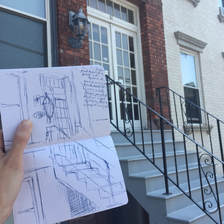 I draw the residence from several angles, and take photos while there. Drawing a place in person gives a better sense of the building in its surroundings - in this case, packed in with several other historic brownstones in urban Albany near Center Square and the Plaza. 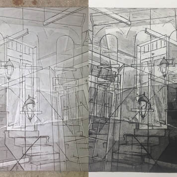 Several more drawings on tracing paper are combined to create a plan for etching an aluminum printmaking plate. I coat it in an acid-resist and etch the lines, then stop out several layers of open-bite etching for aquatint - fellow intaglio printmakers can share my excitement in being able to aquatint without rosin or a hot plate! I pull an artist's proof on paper before moving on. 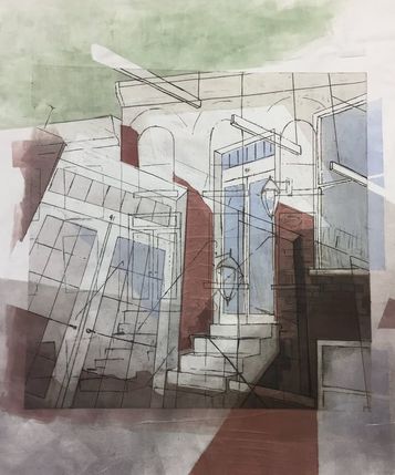 After printing the image on linen, I add layers of flat, transparent color using ink rolled directly on the press bed with paper stencils. Irving had many passes through the press to build up the atmospheric light and richness of the brick. The colors I choose come from recollections and descriptions by residents, or from my observations in seeing the exterior - in this case, both. The reds are a reference to the brick, the blue is a scrap of reflected sky, and the hint of green is actually a nod to an odd little plant that Cindy mentioned killing during her summer there... I felt the color would make a nice addition, and it seemed like an amusing detail to have remembered for so long. Though the printing is done, the process is not yet finished. I plan and build a stretcher frame, then add tilted planes of wood to break up and physically manipulate the dimension of the surface. Cutting up the print is by far the most terrifying part of the process. After adding a few pieces of plexiglass and leaving the piece alone for a few days, I find a tiny sketch from right after our interview - a single floating window frame. Many thanks again to Cindy Henry for sharing her time in an interview, and to the Decentralization Regrant Program of the NYS Council on the Arts, without which this project would not be possible. I am still looking for one last Albany County resident or former resident - if you have lived in the former South Mall neighborhood, or in Guilderland, Latham, or Colonie, please reach out!
 A test plate with lines etched using an acrylic hardground A test plate with lines etched using an acrylic hardground This spring I was fortunate to receive a grant through the Arts Center of the Capital Region's Decentralization re-grant program, and it has led to a lot of experimentation that I think might be helpful to other printmakers out there! I'm very excited about the project's early phases and I thought I'd share some of what I've learned so far about etching aluminum plates. I did a lot of research before deciding that aluminum was the right choice of materials for the project, but I was still surprised by some of the issues that popped up - the main one being the need for an effective yet easy to remove acid resist or etch resist, known as a hardground. 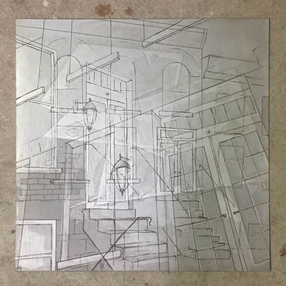 One of my etched aluminum plates featuring both an intaglio line etch and an aquatint-style etch. One of my etched aluminum plates featuring both an intaglio line etch and an aquatint-style etch. Before we get into the topic of hardground, it is important to know that I am using aluminum plates and a copper sulfate etch. This etch is only recommended for silver-toned metals: aluminum, zinc, and steel. The argument for aluminum was strong given the context of the small editions I'd be printing and the size that I wanted to work. Aluminum is not as durable as zinc, meaning a limited number of prints can be made before quality deteriorates, but for a given size plate zinc costs nearly three times as much as aluminum. Another mark in favor of aluminum is the fact that any open bite is self-aquatinting, allowing for watercolor like areas of value. In order to get the same effect in zinc, one needs access to rosin (a hazardous substance if inhaled) and a hot plate.
The copper sulfate etch I am using was studied and published by artist Nik Semenoff and chemist L.W. Bader, and is far safer than a traditional etch using nitric acid. While not harmless (the solution does etch metal after all), the etch contains ingredients that were affordable and convenient. Semenoff and Bader detail the science behind the process, as well as how to revive or dispose of spent etch in their 1998 article "Intaglio Etching on Aluminum and Zinc Using an Improved Mordant.” To hear more about the approaches I tried and their results, continue reading below. Algorithms is a group show currently on display at Scarlet Seven Fine Art Gallery in Troy, NY, and features myself and four other artists. In addition to several new and recent works of my own, the show includes work from Christopher Murray, Ralph Mercer, Channing Lefebvre, and Justin Kane. The show is up through March 25th and gallery information can be found here!   Christopher Murray is an artist and art educator whose large-scale rugged, foggy mountain-scapes seemed at home on the expansive brick walls of the gallery. Each painting is made up of countless fragments of newspaper layered and glazed with hints of color and shadow. How many hours can a person spend on an artwork? I’m not sure but Murray’s time commitment is clear in each piece of torn and painted newspaper. Ralph Mercer’s fragmented, hard-edged shapes combined with curving female forms were an interesting complement to the group and helped tie together the organic and structural within much of the other work there. His use of photography felt very much layered in a similar way to printmaking and painting, and the black and white pieces were a clear, fresh comparison to the whole of the show.  Channing Lefebvre shared work from two bodies of work that at first seem visually unrelated, but upon closer inspection present interesting aesthetic and conceptual parallels. Elements of intricacy are combined with minimal influences, and evidences of time and wear combined with soft, clean tones within a rectangular structure. My favorite pieces were the etchings made from the scratched up and worn down backs of the engravings Lefebvre uses in his job as a commercial printer; simple monochromatic pieces with little lines and shapes clustered along the edges.
Architectural imagery is most of my work, and those who know me usually know that I use primarily local and regional sources. A lot of these buildings are those I walk or drive past so often I hardly notice them, but my favorites are those I have ties to – places I’ve lived in Albany, the house I grew up in, or the homes of family members.
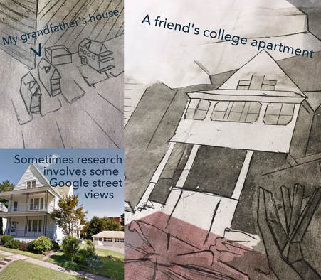
Sometimes it takes a step back for me to see the bigger picture again. The extent to which viewers recognize place is hit or miss – close family will recognize my grandfather’s house, while a stranger might only have a sense of Albany’s varied architecture, if anything. 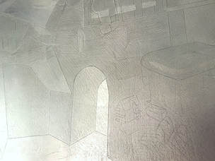 Detail of an etched zinc printmaking plate Detail of an etched zinc printmaking plate I heavily reuse my etched printing plates (so much that the lines in the zinc are wearing down in many) – which means that places that were once clear have been so long and so often reprinted, rearranged, and recycled that it takes time for me to identify them. As the plates wear down physically, there is a metaphorical wearing down and smoothing of the images - a once recognizable façade becomes only an echo or impression of a house, eventually even a symbol or motif.  As much fun as it is for me to play “I Spy” with places I know, I have plans to explore others’ perspectives and experiences. If you have lived in Albany county or one of the surrounding areas, and would like to be a guinea pig of sorts, I’d love to interview you over coffee! I’m looking to interview a wide range of people about places that they previously lived – not just about the home’s appearance, but about the memories and associations with the space. Please contact me if you’re interested!  Sage College in Albany, New York hosted a unusual event: "Steamroller Print Day." I walked into the Armory on Saturday morning to find a small crowd of students and faculty inking up plates that varied from reasonably sized collagraphs to a 4 foot by 9 foot woodcut, with the driver watching dubiously as he lined up his full sized steamroller. 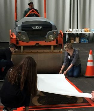 Many of the artists were students in the undergraduate program at Sage, but the massive woodcut was carved by two Niskayuna High School students, and was being inked and printed by two more students from Niskayuna. I was impressed to hear they’d used a dremel for easier carving – some woodcuts might need to happen in my own studio soon. Also, can I use a dremel to etch zinc plates?
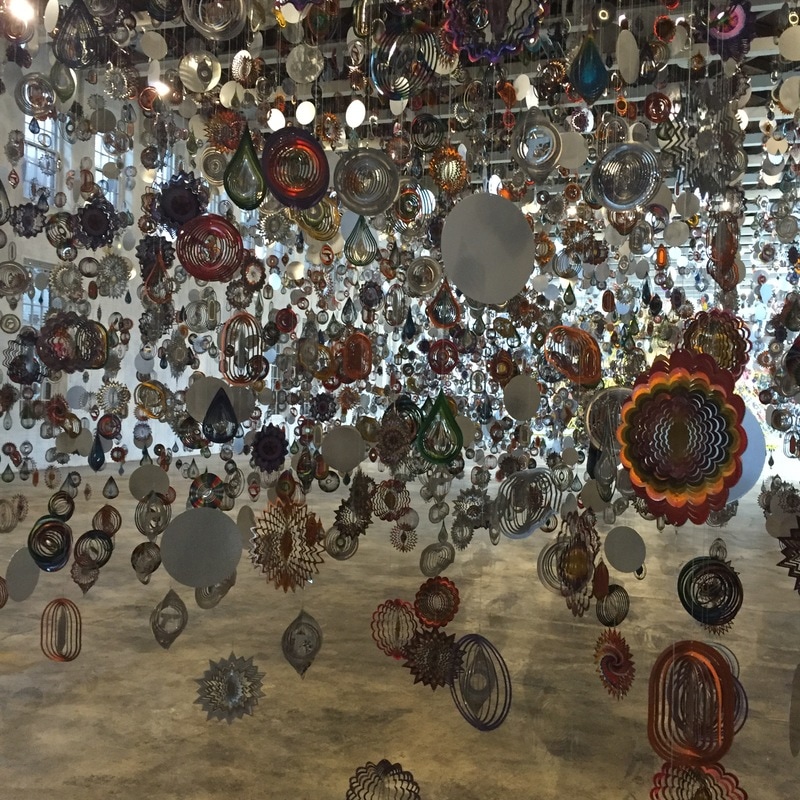
Until opens with an immersive forest of metallic lawn spinners. While mesmerized by all of the fluttering ornaments, more sinister symbols – guns, bullets, teardrops – plainly show amid the shining suns, circles, and flowers. The guns spin madly – they point everywhere yet nowhere. An ominous whirring sound of fans across the building adds a thick layer of anxiety. A pair of girls takes a selfie – are they so spellbound by the shining and spinning that they don’t consider the guns? 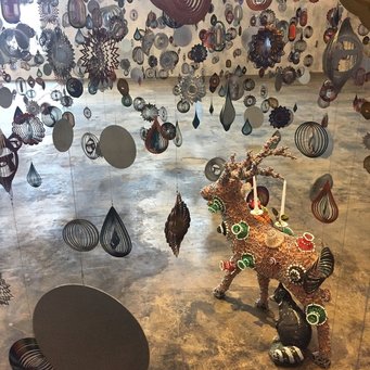 Cave packages a weighty significance in a light and seductive material.
In the middle of this is an ivory stag figurine, almost hidden and easy to miss. At first I hadn’t given it much thought, but when a friend asked why it was there the metaphor became clear: an animal often hunted (now surrounded by guns), its nearly white color a hint at symbolic innocence, covered in glistening beads and sharing a visual decadence with the rest of the exhibition.
|
Katherine ChwazikArtist. Art Teacher. Smallbany Gallery. © Katherine Chwazik 2024, All Rights Reserved
Archives
July 2020
|

 RSS Feed